
I see the Conservative party has adopted a new logo, with a strangely familiar right-leaning maple leaf.
![]()
![]()
In their case, they say it’s in a position to take off towards the stars.”
“The new maple leaf, that still anchors us to remind us that it’s always Canada first, is now in position to take off towards the stars, symbolizing our new leader’s motto – through adversity to the stars.”
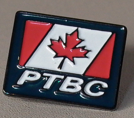
Wow. That’s quite an explanation. In the case of our PTBC logo, I just say it’s properly right-leaning.

Writer and Executive Editor for ProudToBeCanadian.ca.
PTBC was founded by Mr. Johannesen in 2000.
Contact Mr. Johannesen about this article using this form. Please refer to article's title.
FOLLOW @JoelJohannesen ON X!
PTBC was founded by Mr. Johannesen in 2000.
Contact Mr. Johannesen about this article using this form. Please refer to article's title.
FOLLOW @JoelJohannesen ON X!
Latest posts by Joel Johannesen (see all)
- Canadian Liberals and other leftists hated America 20 years ago too - Wednesday July 23, 2025 at 3:25 pm
- “PROUD?” —PROJECT SUSPENDED - Monday July 21, 2025 at 11:35 am
- Proud To Be Canadian? Maybe Not. - Tuesday December 17, 2024 at 2:07 pm


